Our Blog
Our Latest Blog
Explore our blog for fresh ideas, trends, and useful tips to grow your business!
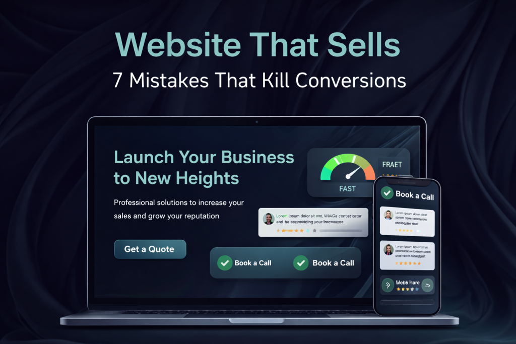
Website That Sells: 7 Mistakes That Kill Conversions
A website that sells is not about design alone. Many businesses invest in beautiful websites but still don’t get leads or sales. The reason is simple: small mistakes quietly kill conversions.
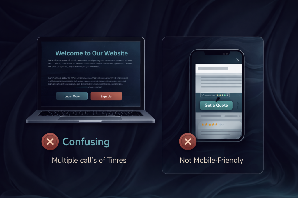
One of the most common problems is unclear value proposition. When visitors land on your website, they should immediately understand what you offer, who it’s for, and why they should choose you. If this message is vague or hidden, users leave within seconds.
Another mistake is focusing on aesthetics instead of usability. Overloaded animations, complex layouts, and excessive effects may look impressive, but they slow down decision-making. A high-converting website guides users smoothly toward action, not distracts them.
Weak calls to action are another conversion killer. Buttons like “Learn More” without context don’t motivate users. Effective CTAs clearly explain what happens next and why it matters.
Slow loading speed also damages conversions. If your site takes more than a few seconds to load, users simply close it. Performance is not a technical detail — it’s a sales factor.
Many websites fail because they are not mobile-friendly. Today, most users browse on smartphones. If your website is hard to read, scroll, or interact with on mobile, you lose a large share of potential clients.
Lack of trust signals is another hidden issue. Testimonials, real cases, certifications, and clear contact information help users feel safe. Without trust, even interested visitors won’t convert.
Finally, confusing navigation pushes users away. If people can’t easily find what they’re looking for, they leave. A selling website is always simple, logical, and intuitive.
Fixing these mistakes doesn’t require rebuilding everything from scratch. Often, small strategic improvements can dramatically increase conversions and turn your website into a real sales tool.